Search
A search interface with faceted filtering. Contains a child listing block for results and typed facets (checkbox, select, date range, toggle) for filtering.
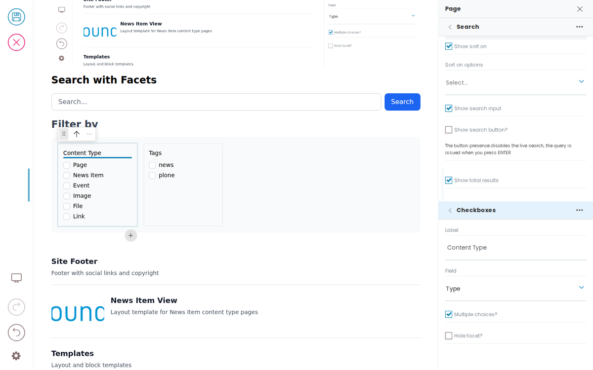
Search with Facets
Filter by
Previewing and Testing Content
Preview content locally by serving the Markdown through the mock API, and check it with the block sanity test — which discovers every block on the served content and verifies it renders across frontends.
Content as Markdown
Author Plone block content as readable Markdown. One loader turns a .md file into block JSON, so the same file is the content the API serves, the deploy ships, and the docs render — with no JSON to hand-edit.
Templates & Layouts
Templates allow editors to centrally control content and reuse content. They allow a developer to not have to hard code layout decisions and instead use rules to apply user layouts in template content stored separately from the page, or give the user a choice on which layout they want.
Server-rendered frontends
Inka works with any frontend, including ones that have no client-side
Live Preview
To make your site editable with Inka you load hydra.js in your frontend and call initBridge(). This sets up a two-way communication channel that handles authentication, page navigation, and live content updates.
Simple Search
Text
The Text Block allows you to add text to a web page. The text can be formatted and structured in different ways (bold, headings, etc.).
Separator
The separator block allows blocks or groups of blocks to be visually separated by a horizontal line.
Listing
The listing block allows the display of various listings of content. Editors can configure a number of criteria for listing content (e.g. all news from 2022 with the keyword 'research').
Introduction
The introductory block allows the display of an introductory text, which is displayed larger than normal continuous text.
Image
The image block allows images to be embedded in various display formats. Images can be displayed in different sizes (100%, L, M, S) and aligned left, right or center of the text flow.
Highlight
The highlight block allows you to highlight and tease a single piece of content. The content is displayed with a large image and a title and description in a banderole.
Developer Reference
Schema
Pass this object inside the blocks option when calling initBridge() to register this block type with the admin UI. See Custom Blocks for the full setup guide.
{
  "properties": {
    "variation": {
      "title": "Variation"
    },
    "query": {
      "title": "Query",
      "widget": "querystring"
    },
    "listingBodyTemplate": {
      "title": "Results template"
    },
    "showSearchInput": {
      "title": "Show search input",
      "type": "boolean"
    },
    "showSortOn": {
      "title": "Show sort on",
      "type": "boolean"
    },
    "showTotalResults": {
      "title": "Show total results",
      "type": "boolean"
    },
    "sortOnOptions": {
      "title": "Sort on options",
      "type": "array"
    },
    "facets": {
      "title": "Facets",
      "widget": "object_list",
      "typeField": "type",
      "allowedBlocks": [
        "checkboxFacet",
        "selectFacet",
        "daterangeFacet",
        "toggleFacet"
      ],
      "defaultBlockType": "checkboxFacet"
    },
    "headline": {
      "title": "Headline",
      "type": "string"
    },
    "title": {
      "title": "Title",
      "type": "string"
    },
    "facetsTitle": {
      "title": "Facets title",
      "type": "string"
    },
    "quickAnswerSample": {
      "title": "Sample question",
      "type": "string"
    },
    "quickAnswer": {
      "title": "Quick answer",
      "widget": "blocks_layout",
      "allowedBlocks": [
        "quickAnswer"
      ]
    },
    "listing": {
      "title": "Results Listing",
      "widget": "blocks_layout",
      "description": "Listing block to render search results",
      "allowedBlocks": [
        "listing",
        "default",
        "summary",
        "teaser",
        "image"
      ],
      "maxLength": 1,
      "defaultBlockType": "listing"
    }
  }
}
JSON Block Data
Example JSON as stored in the Plone content API. This is the data structure your component will receive in the block prop.
{
  "@type": "search",
  "headline": "Search with Facets",
  "listingBodyTemplate": "summary",
  "facetsTitle": "Filter by",
  "facets": [
    {
      "@id": "facet-type",
      "type": "checkboxFacet",
      "title": "Content Type",
      "field": {
        "value": "portal_type",
        "label": "Type"
      },
      "multiple": true,
      "hidden": false
    },
    {
      "@id": "facet-subject",
      "type": "checkboxFacet",
      "title": "Tags",
      "field": {
        "value": "Subject",
        "label": "Tags"
      },
      "multiple": true,
      "hidden": false
    }
  ],
  "blocks": {
    "facet-listing": {
      "@type": "listing",
      "variation": "summary",
      "querystring": {
        "query": [
          {
            "i": "path",
            "o": "plone.app.querystring.operation.string.absolutePath",
            "v": "/"
          }
        ],
        "sort_on": "effective",
        "sort_order": "descending"
      }
    }
  },
  "blocks_layout": {
    "listing": [
      "facet-listing"
    ]
  },
  "query": {
    "b_size": "4",
    "query": [
      {
        "i": "path",
        "o": "plone.app.querystring.operation.string.absolutePath",
        "v": "/"
      }
    ],
    "sort_on": "effective",
    "sort_order": "descending"
  },
  "showSearchInput": true,
  "showSortOn": true,
  "showTotalResults": true
}
Rendering
How this block renders in your frontend. Add its handling to your renderer, or — for list-style blocks — register a fetcher and reuse your list rendering.
function SearchBlock({ block, blockId }) {
  const [query, setQuery] = useState('');

  const facets = (block.facets || []).filter(f => !f.hidden);
  const listing = block.blocks_layout?.listing || [];
  const listingId = listing[0];
  const listingBlock = listingId ? (block.blocks?.[listingId]) : null;

  return (
    <div data-block-uid={blockId} className="search-block">
      {block.headline && <h2 data-edit-text="headline">{block.headline}</h2>}
      <input
        type="search"
        placeholder="Search..."
        value={query}
        onChange={e => setQuery(e.target.value)}
      />

      {facets.length > 0 && (
        <div className="facets">
          <h4 data-edit-text="facetsTitle">{block.facetsTitle || 'Filter'}</h4>
          {facets.map(facet => (
            <FacetRenderer key={facet['@id']} facet={facet} />
          ))}
        </div>
      )}

      {listingBlock && (
        <ListingBlock block={listingBlock} blockId={listingId} />
      )}
    </div>
  );
}

function FacetRenderer({ facet }) {
  switch (facet.type) {
    case 'checkboxFacet':
      return <fieldset data-block-uid={facet['@id']}><legend data-edit-text="title">{facet.title}</legend>{/* checkbox options */}</fieldset>;
    case 'selectFacet':
      return <label data-block-uid={facet['@id']}><span data-edit-text="title">{facet.title}</span><select>{/* options */}</select></label>;
    case 'daterangeFacet':
      return <label data-block-uid={facet['@id']}><span data-edit-text="title">{facet.title}</span><input type="date" /> – <input type="date" /></label>;
    case 'toggleFacet':
      return <label data-block-uid={facet['@id']}><input type="checkbox" /> <span data-edit-text="title">{facet.title}</span></label>;
    default:
      return null;
  }
}